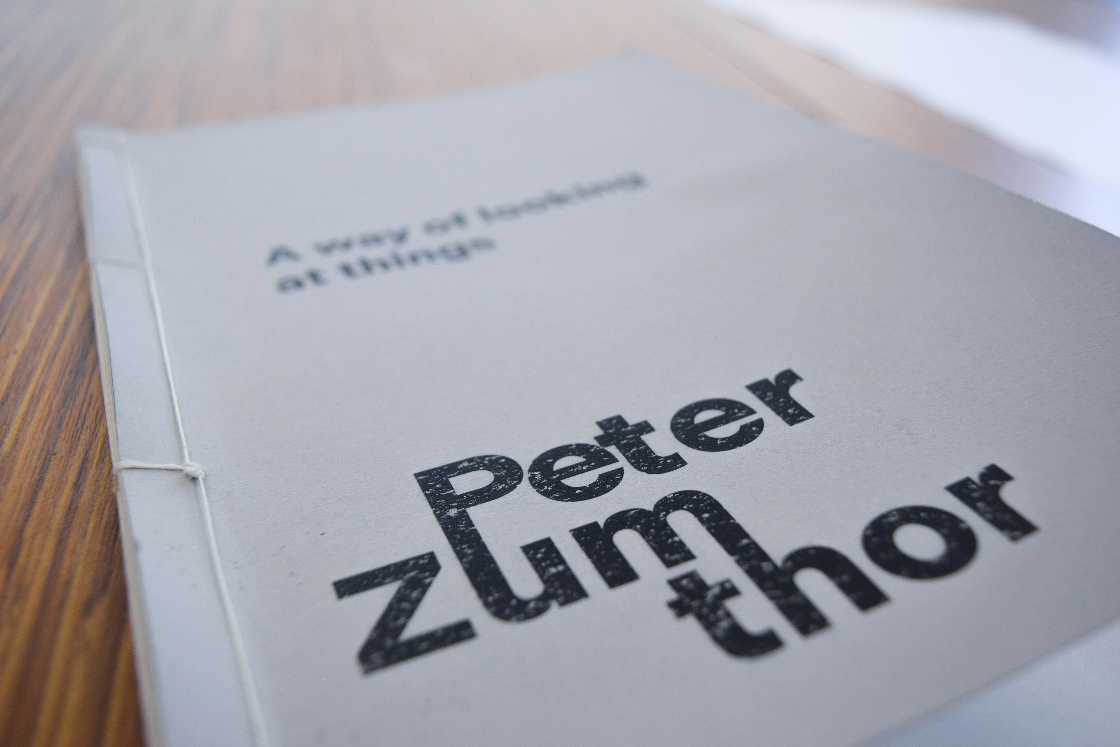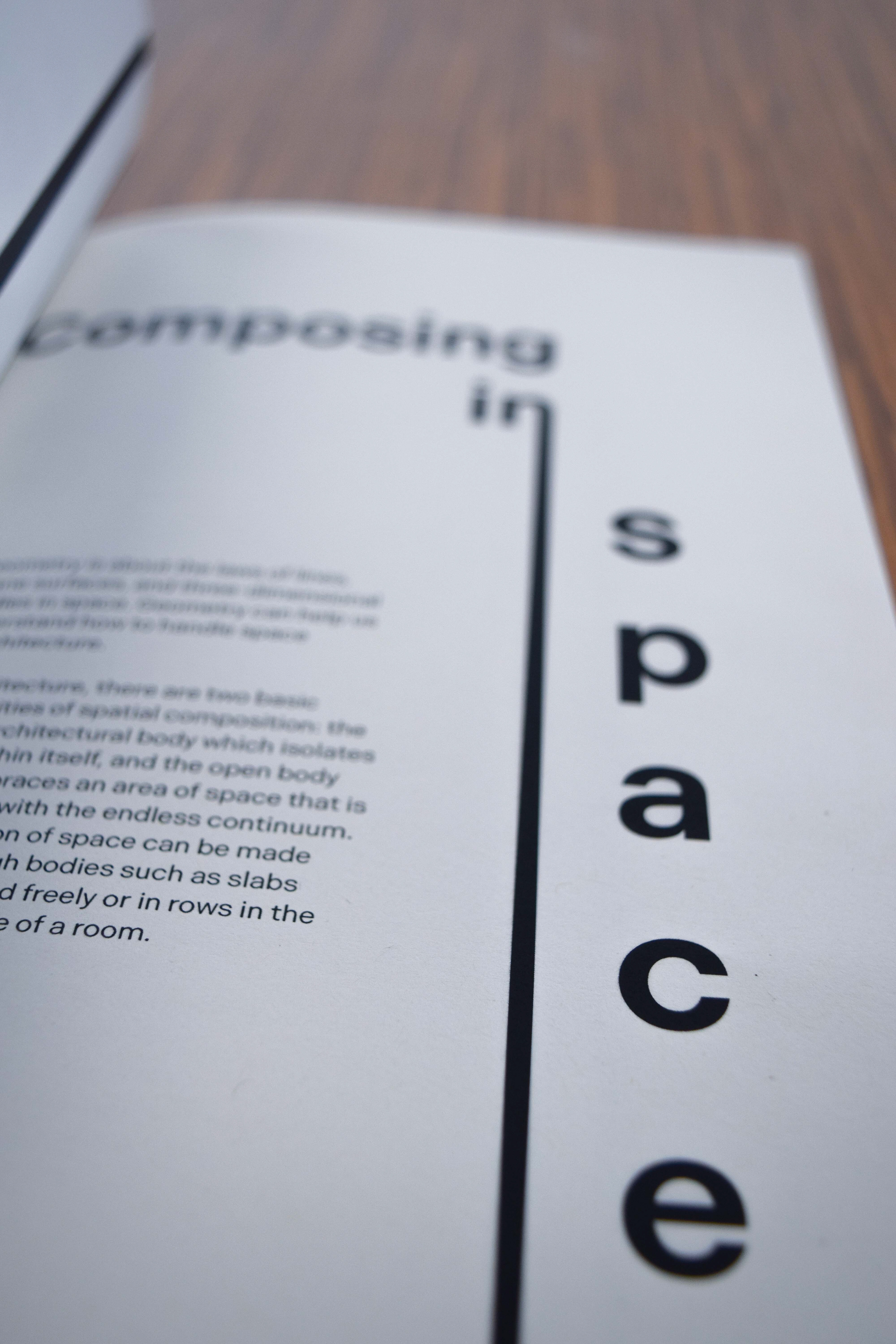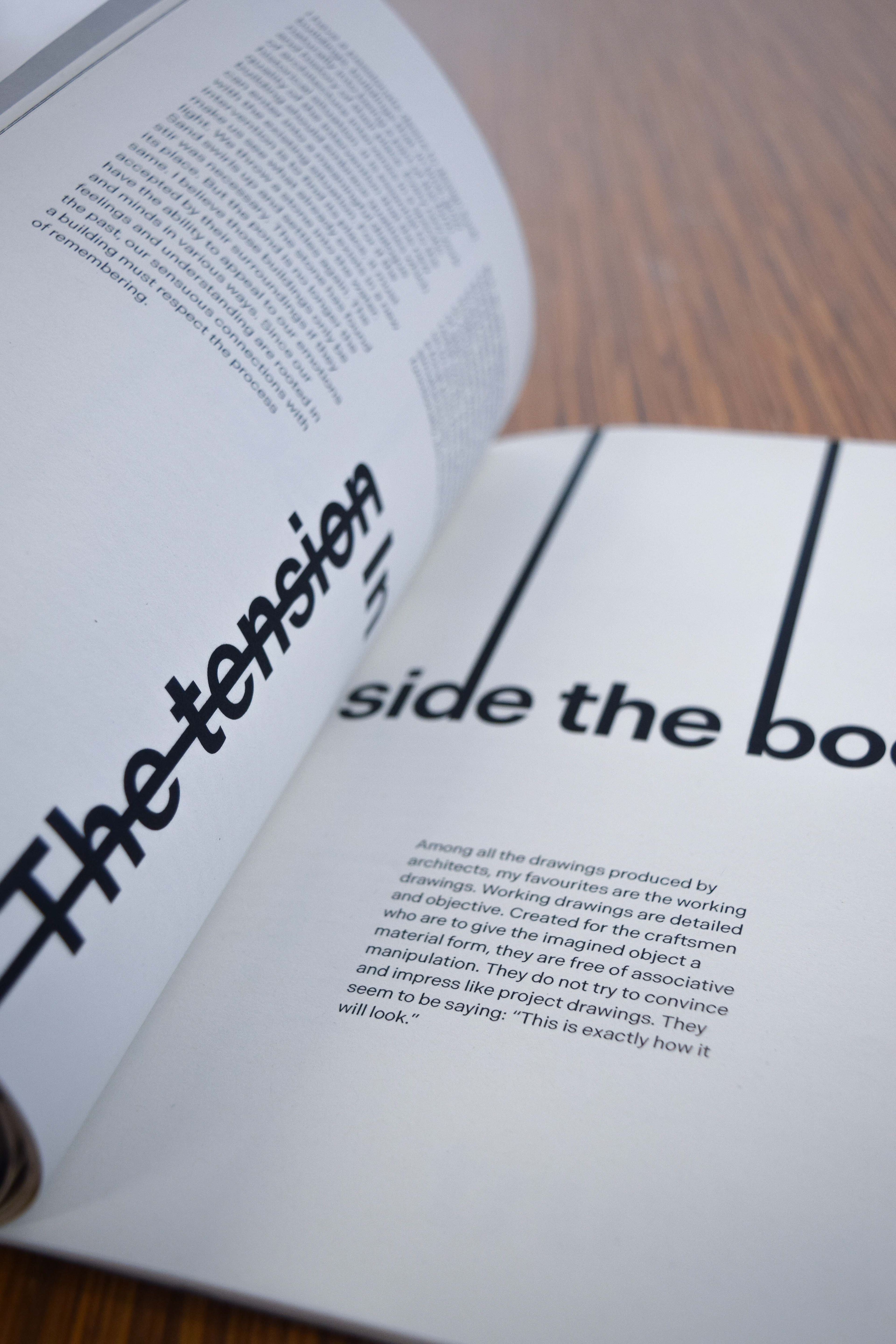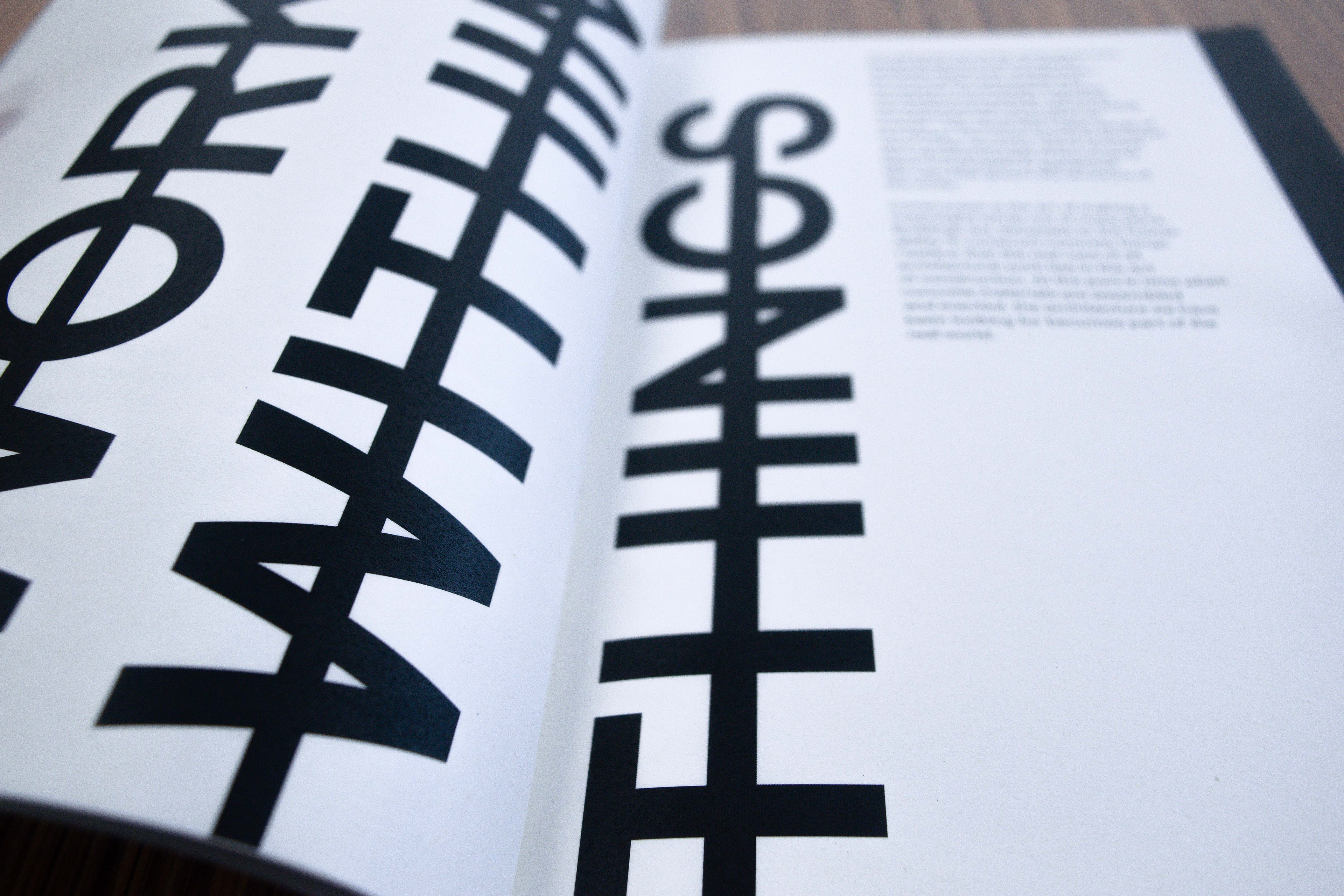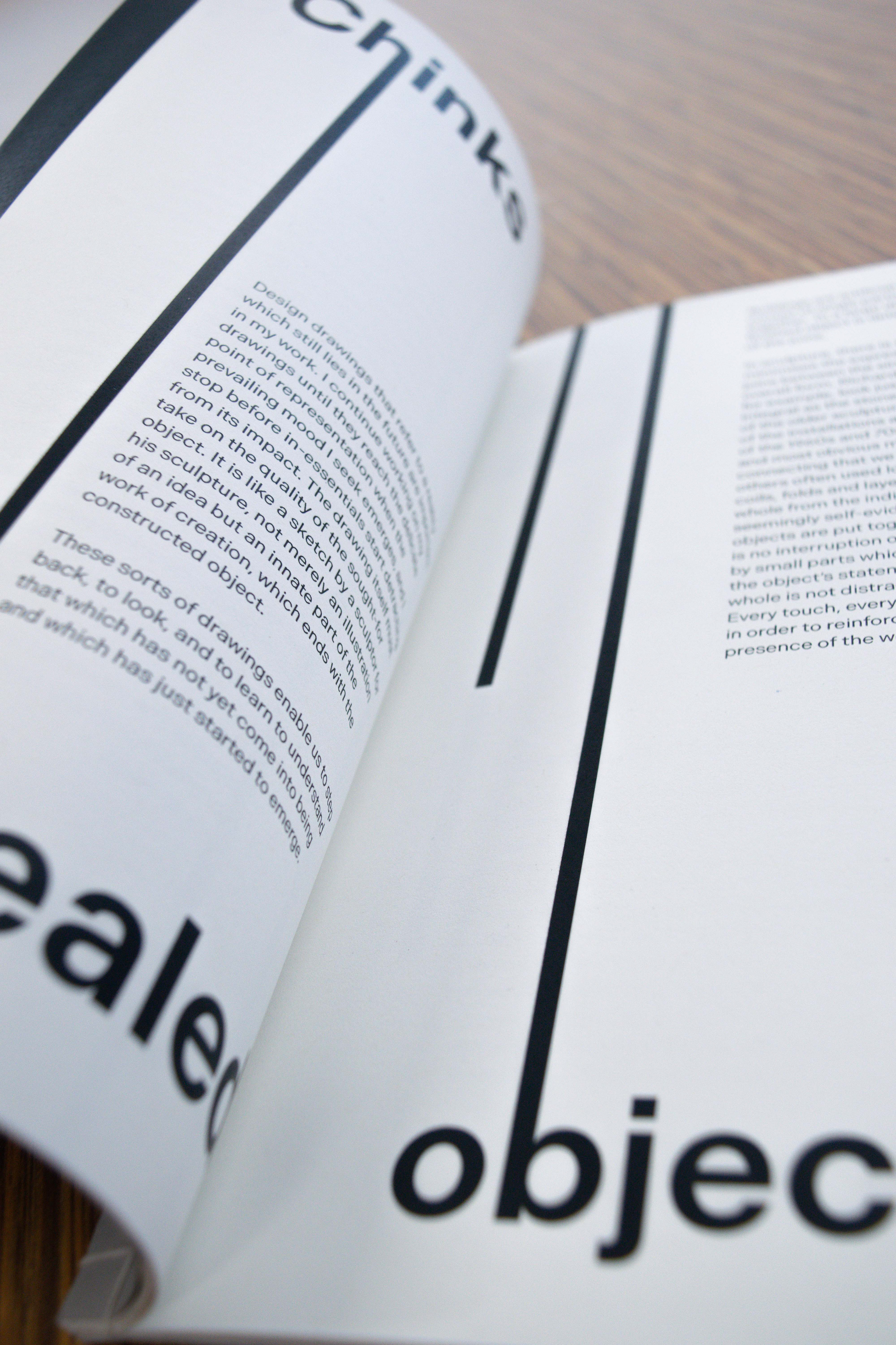
I was tasked with designing the text ‘A Way of Looking at Things’ by Peter Zumthor using just two colours. I used the concept of lines throughout the book to visually represent the books content on architecture and to give readers a direction to follow while progressing through the book.
When binding my book, I used a French folding book binding technique to create clean smooth edges for my book. I paired this with a traditional Japanese stab binding to keep a handcrafted feel to my book. I kept my colour palette neutral by using grey as my secondary colour for the cover alongside black text.